


IRL Unitrans Report 2025
ASUCD Innovation and Research Lab
Primary Contributors: Jeremy Elvander, Associate Director; Isabella Gonzales, Researcher; Meenakshi Iyer, Researcher; Brady Horton, Researcher
External Contributors: ASUCD Unitrans — Jeffery Flynn, General Manager
Introduction & Objectives
Unitrans plays a vital role in connecting the UC Davis community, making the analysis of its operations crucial for a reliable transit system. This report examines May 2024 Unitrans operation data to identify trends and opportunities for improvement. By analyzing this ridership data, we can allow for targeted adjustments to improve punctuality and manage bus capacities more efficiently. This analysis can also help to guide resource allocation, ensuring that buses are available where and when they are most needed. Through detailed data exploration, we address challenges such as inaccuracies in passenger counts and time recordings, proposing actionable recommendations like adopting Automated Passenger Counting (APC) systems.
Data Exploration and Analysis
Our data exploration started with looking at a histogram of the “earliness”, or the negative values, of the late/early data. Our initial expectation was that these values would be in a relatively small range around 0, however much of the data was in the extremes with earliness values of -500 or greater in magnitude. When we looked into early/late values using this data it was difficult to discern any trends without significant data cleaning and outlier removal. To understand the scope of the outliers we plotted a histogram of the early values greater at 30 minutes early which is the figure shown below. These extreme values could be caused by inaccurate record keeping or anomalies in how the data was collected. By refining the data collection and analysis processes, we can ensure that the resulting insights are truly reflective of the system's performance, ultimately leading to more precise adjustments to the efficiency of Unitrans.

When looking at the histogram of crowd sizes, labeled as crowd# in the dataset, there is a significant spike at 90. We believe that this is indicative of inaccurate record keeping and an estimation of rider counts. This apparent ceiling in crowd size suggests that data collectors may be using '90' as a default or maximum value when actual counts exceed this number, the bus seems approximately full, or when precise counting becomes impractical. To address this issue, it would be beneficial to implement more accurate and reliable methods of measuring crowd sizes.

On-time performance was also analyzed on a per-line basis, leading to insightful analysis and hypotheses regarding why certain lines were late. To do this, filtered data was grouped by line, with a ‘late bus’ being classified as a bus arriving more than 5 minutes after its scheduled arrival time. As done previously, buses that were more than 60 minutes late or early were omitted from analysis due to data collection and cleaning issues. From this cleaning, statistics were generated on the average time a line was late/early (in minutes) across all runs, and the percentage of runs that were late per line. These two statistics are closely related.

When diving deeper into on time performance, it became apparent that the data available was not sufficient in explaining what led to delays for different lines. Passenger stop data was manually collected through unitrans.ucdavis.edu/routes, considering the ‘full list’ of stops for each line. Only select stops are considered ‘timed’ (meaning they have a scheduled arrival time), whereas most stops are made by request only. After counting the number of stops for each line, stoplight data was manually collected as well by following Unitrans routes on Google Maps, counting intersections with stop lights along the full length of the route. With this data collected, it was possible to cluster lines into ‘lateness’ groups using K-Means Clustering analysis. 4 distinct clusters were identified based on a generated Scree plot analyzing Within Sum of Squares (WSS), pictured below (Appendix Figure C).
The T line was clustered into its own group, logically due to its nature as a special service line. The P and Q made a 2nd distinct cluster, due to their similarities as clockwise/counterclockwise perimeter routes. The A, L, O, and Z lines made up a third cluster. The A, O, and Z lines are the only lines to travel through 2nd street in downtown Davis (while the L line also passes through downtown on an alternate route). All other routes belonged to the 4th cluster.
With groups based on line performance formed, the relationship between the length of a trip (in miles) and the number of stops/red lights was examined. Both response variables were strongly positively correlated with the length of a trip, except for the T line. The T is a very long route (in miles), and therefore hits more stop lights than any other route in the system. However, the T makes special stops only, making its passenger stop count much lower relative to the length of the route. This number of stops was considered an outlier, since the T’s status as a ‘special service’ line harmed regression analysis usability. Prediction power improved for the number of passenger stops specifically when the T was removed from analysis.

The number of passenger stops impacted analysis when predicting on time performance as well, leading to the T’s exclusion in this analysis as well. It should be noted that when analyzed individually, the number of passenger stops was not a strong predictor of lateness.

Through analysis, it was noted that models using ‘stops’ and ‘redLights’ as predictors exhibited signs of multicollinearity, reducing predictive power. This is logical, as the number of stops likely indicates a longer route, which would lead to more stop lights. Higher order models (such as quadratic simple and multiple regression) were considered, but ultimately discarded due to individual predictors failing to meet a significance level of 0.05.

Ultimately, two multiple regression models to predict the related avgLate_Early and propLate attributes were created, both using stops and redLights as predictors. These models exhibited relatively high predictive power while exceeding the significance level to be considered useful (0.05). Residual Standard Error was low, and the linear regression assumptions (such as normality and homoscedasticity) were visually confirmed to be followed through model diagnostic plots (Appendix Figure E & F). With no issues in multicollinearity, these final models were selected to evaluate the relationship between bus stops, stop lights, and route on time performance.
Data exploration also included an analysis of ridership and the factors that contributed to it, such as frequency of service and average capacity of lines. Total ridership was calculated by summing the “IN” and “OUT” attributes, which describe the number of riders that enter a bus from terminal station before departure, and the number that exit after arrival and completion of one ‘run’. Frequency was determined per route for the entire month by counting the number of entries for each line. “Tripper” buses, which are vehicles that trail a main bus on an individual run to supplement capacity, were not counted as separate runs in frequency analysis. Average capacity was determined using the ‘Capac’ variable, which describes the approximate ideal upper bound for an individual bus (including seated and standing passengers). Single deck buses have a stated capacity of 60 people, whereas double decker buses have a capacity of 120. These capacities were averaged per line based on the number of trips they took in May 2024, with tripper buses representing added capacity for an individual run.
To gather an idea on the relative efficiency of an individual line, passenger ‘load factor’ was calculated, which represents the number of total passengers for one line divided by the total capacity of that line. Load factor is a measure of how well used a line is, and how close to capacity that line is.

Key Findings
Finding #1: On average, the L line is most early and the T line is most late

When averaging the number of minutes late/early per trip across lines, after filtering out the outliers discussed above, the T line was around 10 minutes late on average while the L line was a little over 5 minutes early on average. This is a representation of the average number of minutes, so despite the outlier removal, it is still prone to being influenced more by values near the extremes. Later, we discuss the frequency of late buses, which provides different results.
Finding #2: Buses tend to be late more often in the morning and afternoon, and are more likely to be early in the evening

After filtering out for on-call buses, lines that didn’t run, and runtimes that were outside of 60 minutes before or after their scheduled departure, we find that buses are more likely to be late in the afternoon and morning, and more likely to be early in the evening. There are also consistencies across times of day, as the T line on average is shown to be almost always late, and the L line is shown to be almost always early, on average. This time of day discrepancy makes sense logically, as mornings and afternoons are likely the busiest times for students taking the bus, slowing down the lines in the process.
Finding #3: The P and Q lines are the longest routes, and late for more trips than any other line by a significant margin. The T line is late most frequently.

Looking at the frequency of late buses per line, the P and Q lines were most frequently late by number of trips. The P and Q lines are the longest lines in the Unitrans system, meaning more possibilities for delays with an increased number of passenger stops and delays at intersections. As idle time at each stop compounds, it can be difficult for buses to recover from delays. Additionally, longer routes tend to spend more time waiting at stop lights, further increasing the chance of delay. The T line was late the highest percentage of the time, with the P and Q following (along with the U line). This indicates that even when standardizing for the number of trips taken, the three longest routes (P, Q, and T) were late most frequently. The U line represents an outlier in this trend which requires further investigation.

Finding #4: Unitrans ridership is high, but accurate passenger counts are unknown.

Unitrans ridership for May of 2024 totaled 415,077 riders, with the V and J lines capturing the highest ridership. The T and O lines had the lowest respective ridership, and average ridership for the month across all lines was 21,846.16 people. Under current operations, Unitrans only counts riders entering or exiting a bus at a ‘terminal’ station (either the Memorial Union or Silo bus depots). Riders whose origin and destination are not on campus are not counted at all, and riders who board or exit at one of the 8 on campus non-terminal stops are not counted either. For this reason, Unitrans ridership data underrepresents the total number of users, though to what extent is unknown. Ridership estimates based on current passenger counting methods is undoubtedly high, considering the City of Davis’ population and size, though this number is likely significantly higher than current data suggests.
Finding #5: Routes vary in number of ‘runs’ completed and average capacity per trip, allowing for ridership prediction.

Different lines take different numbers of trips, with one trip being defined as the full route of the bus from departing to returning to route terminus. The V and J lines completed the most trips in May 2024, with both running more than 1,000 buses within that month. Both lines run additional service types, such as express or limited service routes. Note that added ‘tripper’ buses were not counted as separate trips in this analysis. The T and O lines completed the least number of trips. It is important to note that certain lines (such as the O line) only run on weekends, while the T specifically is a special service line serving Davis junior high/high schools. With that in mind, it is possible to notice some minor variations in number of trips completed when standardizing by the number of days in a week that a line runs (which is done by dividing total trips by days run per line).

Though mostly the same, it should be noted that the G, K, and M ‘lose’ riders comparatively when standardizing by number of days per week a line run (all three of these lines run 7 days a week).
All bus lines had an average capacity of 60 passengers per run, except for the G, J, V, and W lines, which had an average capacity of 66.60167, 97.60736, 114.04745, and 64.97162 respectively. This additional capacity comes from the use of double decker buses (which have a set capacity of 120, compared to the single decks capacity of 60). Additional capacity also comes from added ‘tripper’ buses, which trail a bus during the same run, further expanding capacity for a specific trip.
Both number of trips and capacity were recognized as potential predictors of ridership, leading to a brief exploration of simple and multiple linear relationships.

Simple linear regression regressing total ridership on the number of runs generated a coefficient of determination of 0.7777, indicating a strong potential relationship. Multiple linear regression, featuring number of runs and bus capacity as predictors, had a strong coefficient of determination of 0.9136, indicating an incredibly strong predictive relationship. In future analysis, average population density per route could be calculated to standardize ridership and further enhance prediction.
Finding #6: The Silo captures more riders with fewer total trips and lines.

When analyzing the number of passengers Unitrans carried for the month of May 2024, the silo carried 59.32%, or 246,215 people. This was done in 5,801 trips, or 49.37% of all runs completed by the system. 7 lines terminate in the Silo, contrasted with 11 in the Memorial Union (the one ‘other’ line represents the T special service line, which does not end in either terminal). This can indicate better campus utilization around the Silo area, or potential for classroom expansion at the Memorial Union. Further investigation into the student/staff/faculty density around the Silo and MU would be needed to determine the Silo’s overperformance relative to the MU.
Finding #7: As the number of stop lights along a line’s route increases, delays also increase.

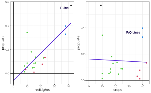
The relationships between the two performance variables (propLate and avgLate_Early) were analyzed in conjunction with stops, the number of passenger bus stops on a route, and redLights, the number of intersections with a stop light along the route. propLate describes the percentage of trips per line (for the month of May) that were greater than 5 minutes late, whereas avgLate_Early describes the arrival time averaged across all trips per line (with 0 representing the scheduled arrival time). Individually, redLights has a positive linear relationship with both propLate and avgLate_Early, whereas stops has a slight negative linear relationship with avgLate_Early and propLate. It should be noted that individually, the number of passenger stops has a weak relationship with on time performance variables, and isn’t useful for prediction on its own. The relationship between avgLate_Early/propLate and redLights is stronger individually, though only moderately useful in prediction.
When these predictors are paired together, the subsequent multiple regression models have strong predictive capabilities for on time performance, with an R-squared of 0.774 for the avgLate_Early model and 0.73 for the propLate model. However, the beta value (or coefficient) of the ‘stops’ predictor is negative for both response variables, indicating that for every one unit increase in stops, on time performance improves. This is likely because the number of stops is an inaccurate metric to assess bus lines by, since their scheduled arrival time (which is what avgLate_Early and propLate are based off of) would be adjusted to accommodate more stops. Additionally, each line only has a select few ‘timed’ stops, whereas most are general stops that will be skipped if not requested. Because of this, lines with more stops may tend to skip more stops on average, though this claim requires further investigation to verify. A more relevant, well-formed statistic could be per-stop idle time, or average idle time across an entire route (‘idle time’ meaning the time a bus is stationary while passengers are boarding/alighting). Ultimately, the multiple regression models were still selected, as the adjusted R-squared was tremendously higher while individual p-values for predictors remained low. In addition to this, the variance inflation factor was low for the two predictors, solving multicollinearity issues that were present in quadratic models. Residual standard error was low and summary plots of the model(s), found in the appendix, indicated all regression assumptions were followed.
Under the final multiple regression models, for each stop light added along a route, average arrival time will increase by 0.3468 minutes, or around 20 seconds. Considering some lines have 20 stops, this can compound into potentially significant delays. For the model predicting percentage of trips late, each stop light added along a route leads to roughly 1.3% more late trips. Though seemingly insignificant, the cumulative impacts of such delays for lines with a large volume of stop lights would be significant.
Finding #8: The U line has the highest passenger load factor, while most of the system falls under 50% of maximum capacity.

As discussed earlier, passenger load factor describes the total passengers a line carries divided by that lines total capacity (which is derived from the average capacity per trip * the number of trips made) for the month of May 2024. The U line, which offers service from West Village to the Memorial Union on weekends only, has the highest passenger load factor of over 90%, indicating that buses are at 90% of maximum capacity on average. The F line had the lowest average utilization at 29.1%. The underlying causes for variation in load factor are poorly understood, with current available data being unable to assist with interpretation. Further study is recommended.
Conclusion & Recommendations
Despite lack of quantitative data, analytical observations and knowledge of Unitrans data collection methods leads us to believe that riders are being significantly underreported within ridership data, as discussed earlier. Trips that do not involve on-campus travel (to specifically the Memorial Union or Silo terminal stations) are not recorded by drivers. Unitrans is a highly successful public transportation system, with varying popularity and on time performance between routes. Though sample data from May 2024 was utilized, this analysis and subsequent conclusions can be generalized to all Unitrans operations, as May 2024 represents a typical full-service month.
- Invest in Automatic Passenger Counters (APC) systems and the necessary staff and infrastructure needed for their operation. Unitrans has historically attempted to use APC systems for accurate per-stop data collection, but due to a lack of technical support has ended use of this technology. Accurate passenger counts and route information has a tremendous impact in the quality of data analysis, preventing inaccurate data (as discussed previously) and increasing the potential for data-driven decision making. Without accurate passenger and performance data, Unitrans is unable to accurately advocate for increased funding and support, both at a small-scale level (ASUCD) and large-scale level (state and federal transportation grants). Additionally, systems for tracking accurate arrival times and temporal performance are crucial for evaluating on time performance system wide while gaining a deeper understanding of the effects of idle times and route design.
- Explore increased frequency and capacity of low-performing routes to maximize potential ridership. Based on preliminary analysis and modeling, routes that run more frequently with a higher average capacity tend to attract significantly more riders (such as the J and G lines). Routes with low ridership, such as the O line, could be optimized through experimentation with frequency of service and/or capacity upgrades (though frequency of service should be prioritized).
- Work with the City of Davis to install Transit Signal Priority (TSP) systems at key intersections to increase speeds along high traffic routes. Though TSP systems exist at some intersections on campus (such as Hutchinson and Health Sciences or Hutchinson and La Rue), there are numerous high profile intersections outside of the UCD campus limits that can cause delays for individual trips because of stoplights. Transit corridors that serve multiple lines (3+) or high frequency lines, such as Russell Boulevard, 5th Street, or Anderson Road, should be evaluated to determine if TSP systems would improve bus performance and reliability. In particular, some intersections that merit further study include Anderson and 8th, Anderson and Covell, Russel and B, Covell and F, and 5th and F.
- Minimize per-stop delays to improve on time performance, especially for high-stop routes. As discussed earlier, the P and Q lines are most frequently late. Though the cause of these chronic delays require further investigation, it is a reasonable assumption based on existing transit literature that the more opportunities there are for a transit vehicle to idle, the higher the chance of delay. This is especially true for high stop lines, such as the P or Q. Minimizing so-called idle time is critical to improving on time performance, and can be achieved through all door boarding and a ‘proof of payment’ ticketing system. Significant rider subpopulations (such as UCD graduate students) do not pay for ‘free’ service like undergraduate students, creating a difficult balancing act of managing different types of fares. To alleviate these issues, ASUCD and Unitrans can work with graduate students to negotiate a self-tax (similar to what undergraduate students do), providing free Unitrans service. This coupled with a proof of payment system can allow drivers to no longer check all passes, minimizing idle time and improving on time performance across the entire system.
Appendix
Appendix A: Supporting Figures


